
Getting things right when setting up a sign design can be tricky! We have compiled 20 Tips for Effective Sign Design to help point you in the right direction when planning signs on your building, shop, site, vehicle or event.
1. Keep it visible and legible.
Remember that people of all ages are either looking through a windscreen, walking by, in traffic, or just on their way to another location day and night. They must be able to see and read your sign easily and quickly at all times.
2. Save the details for the sale.
Don’t attempt to sell them with information on the sign – save that information until they are in your business. Your sign should only display the minimum information to entice customers in. Make sure you can read the entire sign within 5-7 seconds (the five second rule).
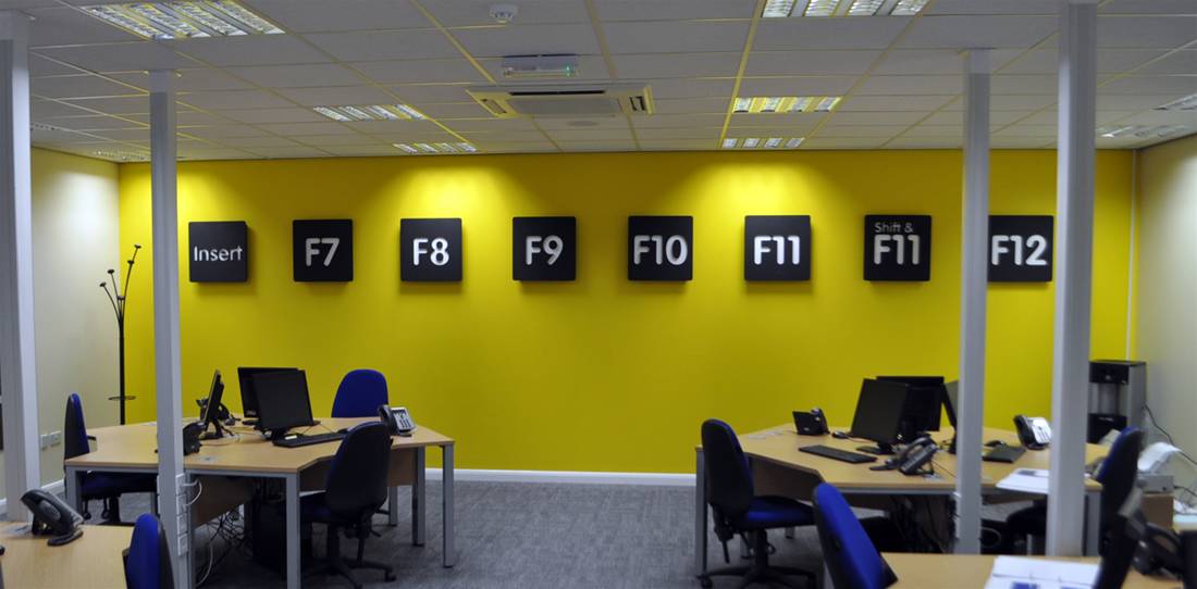
3. Keep it simple.
The proper design of your sign is critical to its effectiveness. Crowding the sign with too many words or lines of text makes it impossible to read from a distance. Use as few words as possible so your signage is legible. Fewer words are better, and three to five words are optimal for quick readability.
4. Grab attention.
There should be something about the sign that will reach out and command attention. Ideally, the first read should be a large pictorial graphic or your company logo, but it can also be large dominating text.
5. Your sign is your handshake.
Think of your sign as your handshake with the buying public, and first impressions are lasting impressions. Your sign must project the image you want the public to have of you. People will judge the inside of your business by how it looks on the outside.

6. Consider using new technologies.
The addition of a time and temperature display or an electronic variable message centre can make your business a landmark in your community. With today’s technology, signs are becoming more effective at delivering their owner’s messages while also becoming more cost effective. The new totem style electronic message signs allow you to change the message on your sign as easily as you change your mind.
7. Appeal to impulse buyers.
Many owners mistakenly think of a sign as merely a device that identifies the business. What they fail to realize is that 55% of all retail sales are a result of impulse buys. People see, shop and buy. If a sign is ineffective, it can actually cost the business owner more in lost sales than the entire cost of a good sign.
8. Aesthetics and suitability.
Your sign must be attractive and appropriate for your type of business. Bright dayglow text in striking patters would probably not suit an antiques business in a Cotswold heritage site for example. Brand your sign to the guidelines of your business and image it portrays.
9. Keep it near the viewer.
Put the sign as close to the street as allowable. This could be an existing fascia board above your shop, on a wall facing the street, as window graphics or even flags outside your company. Eye level signs are seen quicker than those up high or low to the ground. Shop fascia boards are great to show who you are and where are.
10. Make sure your sign is conspicuous.
Your message competes in a complex environment. A passer-by must be able to differentiate your sign from its surrounding environment. Make sure you stand out from the crowd but for all the right reasons!
11. Avoid obstructions.
Make certain the sign can be viewed without obstruction from any source. Drive past your business from all directions to help determine the most visible location for your sign. Sometimes multiple signs will do the best job of being visible. For example a plate and post sign in a V shape will be visible for drivers in both directions.
12. Use pictures or graphics.
Sometimes an attractive pictorial graphic or company logo that clearly grabs a viewer’s attention helps. However overuse of images or graphics can make a sign look cheap and tacky. Use images sparingly and in a considered way, if the image does nothing for your sign other than clutter it then leave it out.
13. Make it memorable.
It should make your products or services, and your location, easy to remember. For example if you are on an industrial estate and have the option for a sign away from the property or at the entrance, it should be simple to read, easy and quickly display where you are or what you do.
14. Make it enticing.
Your sign should make a potential customer want to stop and see what’s inside the business. Entice customers with a few attention grabbing services or products maybe. For example if you sell multiple branded products consider using these brand logos on your sign to show you sell their products. This also helps with achieving the look of quality and prestige.
15. Consider colours carefully.
Too many colours take away from the quick readability of the sign. Again, stay simple. Make sure colours are contrasting. Yellow on white is not readable, whereas black on white is very readable.

16. Consistent visual image.
Ideally, the design and the colours of your building should reinforce the design and colours of your sign (or vice versa). Colour is probably the easiest and most cost-effective device for this coordination of design for business identification.
17. Avoid clutter.
“White-space” is the surface area of a sign’s face that is left uncovered by either text or graphics. The proper amount of white space is just as important for quick readability as are graphics, text and colours. 30% to 40% of the sign’s face area should be left as “white space” for optimal readability.
18. Place it to be seen.
An attractive and well-designed sign will only be effective if it is placed in a location that optimises its visibility to passers-by. Your goal should be to make the sign unavoidable to the passing viewer.
19. Use quality materials.
We only use a quality product and our vinyl, boards, fixings and materials are the best available. “Cheaping out” with inferior materials could end up costing you a lot more. For example, using the correct materials to handle external conditions and harsh weather is very important. Not just for the lifespan of your sign, but also for the safety of passers-by. Going for cheap materials could cause injury and damage your business image.
20. Use a designer who knows the rules and standards for setting up signage.
Your website designer may be great as setting up graphics for use online, but usually terrible for large scale signage work and technical specs for materials and layout. Make sure you use a signs expert for the design as this could save you lots of wasted time when low quality files are supplied or incorrect sizing and materials are requested.

In summary…
Your sign will do many things for your business, from creating the initial impression to providing the message to new and potential customers about your products and services. A sign does this through a combination of light, size, text, construction, placement and more. Keep these design tips in mind as you design an effective sign for your business.