The printing tips for graphic designers we will talk about below are universal requirements. If you follow this advice, you will save a lot of potential headaches and tears with printing issues, errors, or re-print costs.
Expertly printing your work is just as important as the design itself. You need to keep in mind that, sometimes, your design may look different on paper once printed.
To minimise the differences between what you design on the computer and what you get on paper, we have made a list of 7 printing tips for graphic designers and customers.
By following our tips, you’ll notice the difference and eliminate the chance for errors.
First, though, you need to be sure you have chosen the best printing method. We use several different printing processes depending on your print requirements.
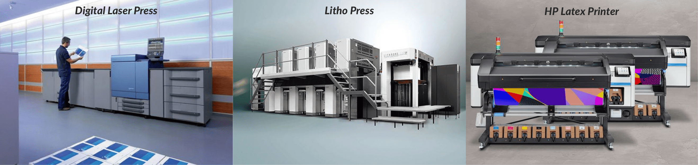
Our digital laser presses use dry toner based ink to print quickly, multiple designs, pages or one off short print runs.
The next method is Litho printing. This process uses a large printing press and wet inks. We use this method to produce longer print runs and specialist papers or card stocks.
The final machine is Latex inkjet printing which is used for large format posters, signs, and banners.
Whilst each method is very different all these processes still require the tips below to achieve best results!
Before discussing the printing tips, you need to know the universal printing format. The format accepted worldwide is Adobe PDF, which means Portable Document Format. Essentially, a PDF document will look the same on any computer and should retain all details and design elements.
Any who, on to the good stuff, here are our top 7 tips:
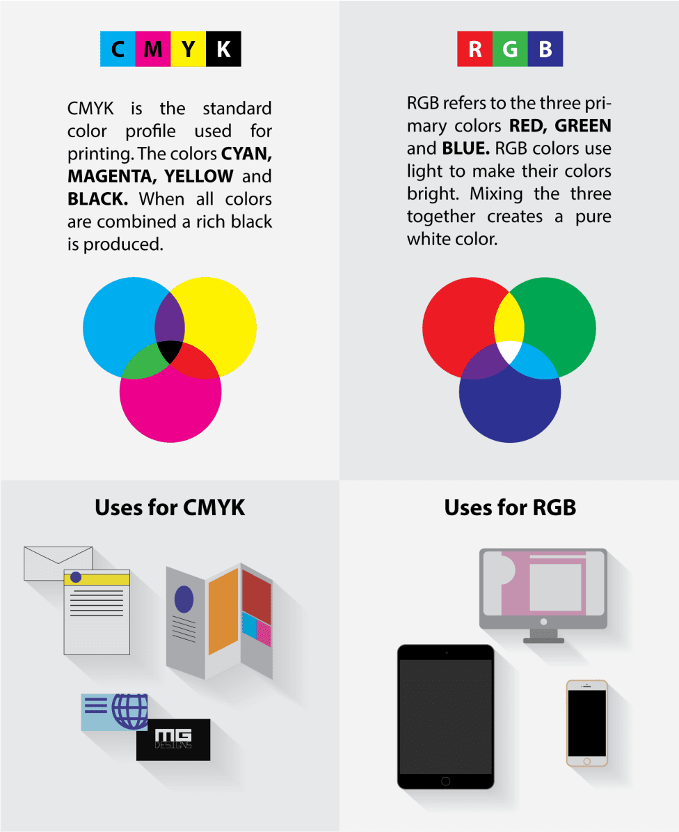
Printing Tips 1. Convert your document from RGB to “CMYK”
Okay folks, bear with us on this we promise this will all make sense.
RGB and CMYK are modes of colours. They are used worldwide when you work on a computer or printer.
RGB means Red, Green, and Blue. These are the colours used in this mode to create all its tones. While CMYK indicates (C)yan, (M)agenta, (Y)ellow, and (K)ey. The colour “key” refers to blac(K), created by mixing all other colours. The final colour when you combine all the tones of RGB is white.
CMYK vs RGB.
The colours on the screen are displayed in RGB, while the colours we see on paper are CMYK. This is because the printer has a restricted colour spectrum. Meanwhile, you can create almost any colour in RGB on the computer.
The best option is to work from the beginning in CMYK to prevent any modification in your design.
To reduce the difference between the colours you see on the screen and the ones you see on in print it is better to convert your document to CMYK before printing.
When you do this, you must be very careful, because some colours in RGB aren’t available in CMYK.
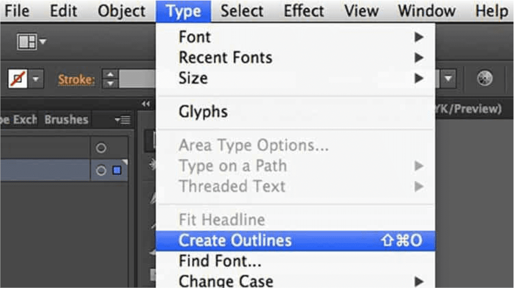
Printing Tips 2. Convert all Fonts to “Outlines”
This is one of the most valuable tips on the list besides the colour Modes. How many times have you received a document and you can’t read it or the typography is different than the one in the original work? This happens more than you think.
When creating your document, you need to know that not every computer has the same fonts installed. This is particularly noticed with Mac and PC font variants. Without the font outlined, some of the letters may not appear at all, and you will only see a black spot or jargon letters.
In order to avoid any potential problems, you must outline all the fonts you use. This simple step will make them look the same on any screen or print.
Printing Tip 3. Image Proportion and Resolution
The size of a digital image can’t be measured in centimetres, and it has to be done by the number of pixels or “dots” it has.
How many columns it has of height and how many rows it has of width. The result of the multiplication of those numbers will be the final size.
The resolution is tightly related to the size, and it is used to value the quality of the image. Basically, it’s how many dots per inch; it is measured in dpi.
They are related so that if you modify one of them, the other will be affected. There is a rule when it comes to resolution.
All the images you’re going to print must have a resolution of 300 dpi, and the ones that are destined to be an internet images have a resolution of 72 dpi.
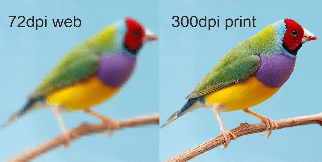
Designers need to play with the image to adapt it to the size they need without modifying the resolution. Like all the rules in the world, it has its exceptions.
If you’re going to print something massive like a large banner, a lower resolution of around 150 dpi will be enough.
Remember, a higher resolution means that the image will occupy more space on your file and can cause issues when printing. So if you supply an image over 300 dpi thinking it will print better, you could inadvertently be causing image processing issues or even images not printing at all.
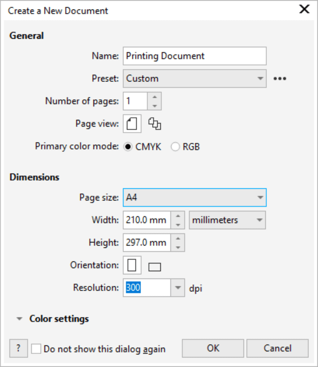
Printing Tips 4. Design at 100% size of your final print
This item is related to the previous one. The size of the image will always depend on the size of the paper. The most commonly used paper size is A4 (210 x 297 mm).
You may need to use a smaller or larger paper size depending on it’s use. For example, smaller for a business card or larger for a sign. It is better to make the design in the correct size from the beginning in these cases. It is always recommended to work on a scale of 100%.
If you don’t change the size of the paper in your design, your print won’t be how you expect it. your print will have less resolution than you expect and be fuzzy, and of course, you will need to print it again.
Sometimes, you might need to change the orientation of the paper to improve the printing.
Printing Tip 5. Make sure you add the correct Bleed
Most printing requires an extra area of bleed to be added around the edges. This is basically an additional overlap of background colour, graphics or images that you want to print right to the finished “trimmed” edge.
The term “bleed” refers to anything that touches the edge of your print. Because prints are usually made on oversized paper, we need this extra margin to trim through. The guillotine cannot cut to a plain white edge. If you supply designs without bleed, due to printer movement you will see inconsistent borders or thin white strips.
Check what bleed requirements are needed for each job. Our standard bleed is 1.5mm on each side for litho print, 3mm for digital and anything up to 50mm for signs and banners.
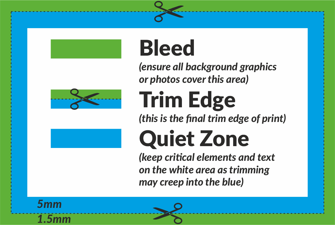
Printing Tips 6. Leave Space around your design.
Similar to bleed, you need to allow for a “quiet zone” around the edge of your design. This space is important for several reasons. It centres the design and doesn’t look like the text is about to “fall of the page”.
Firstly in terms of layout and proportions, it is good to have text and graphics sufficiently spaced away from the trimmed edges. Also if your text is too close to the page edge, it may even be trimmed through due to the small movement of the print during a run.
We recommend a “quiet zone” of 5mm from the edge for business cards and postcards. 10mm for Letterheads, booklets and folders. Or even 50mm for signs and banners.
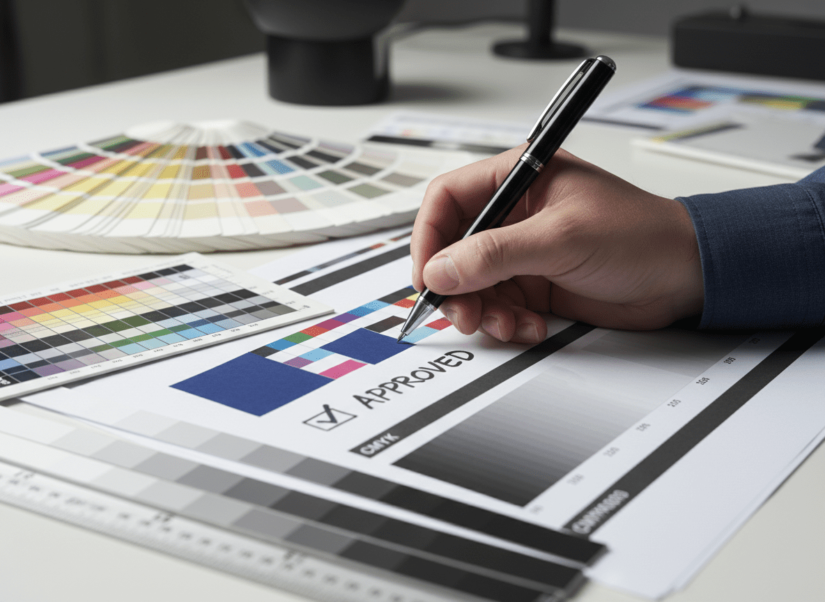
Printing Tip 7. Proof check your own design thoroughly
It is essential to check over the final work before going to print. You must avoid misspellings and layout issues. Also, you need to make sure that all the images have the perfect size and resolution.
It’s always a good idea to ask someone that doesn’t know about the design to check it out. A new pair of eyes may notice some mistakes that you might be missing out on.
Before sending us your final design, you need to print one yourself to verify how it looks, if the bleed is ok, and if it’s readable.
Remember it is your responsibility to check your design. When sending your file to us for print, you are paying for the service of printing it, not proof checking. If you are in any doubt to the final printed outcome make sure you ask for a printed proof which we can provide.
Final Words
These 7 printing tips will help you improve your designs. By following these simple printing tips you will save a lot of money and time. Remember, time is money!